Site Editor offers a collection of ready-made Navigation Menu blocks (shown below). Select a template Menu block, drag it from the library, drop it onto the Header placeholder (at the very top of the screen) and then configure it to suit your needs.
To select a Menu block for your site:
- Click BUILD in the left-hand sidebar of the Site Editor:

- Switch to the BLOCKS tab and click Menu at the top of the list. In the panel that appears, locate and click the Menu template you would like to use as a header for the website you are building:

- Drag and drop the selected Menu block onto the Navigation Menu placeholder (located at the very top of the screen) when the placeholder is highlighted in red:

The new Header will immediately replace the old one (if there’s any).
You can now resize the Navigation Menu block and modify its look and feel to suit your needs.
To resize Menu:
- hover over it to display the resizing control at the bottom of the block:

- click the resizing control, then drag it upwards or downwards to modify the height of the Header. The resizing control displays the height of the padding on either side of the block, upper or lower. When done resizing, drop the resizing control to save the change and stop resizing:

To change the look and feel of the Header:
- hover over it and click the Layout icon in the right-hand floating sidebar that appears:

The LAYOUT tab consists of 3 sections:
- Top-bar;
- Header;
- Subheader.
Header section opens by default.
That allows you to modify separately the layout of the Header:
- add or remove header elements (Logo, Navigation Menu, Button, or Social section);
- modify the look and feel of the header elements;
- change the order of header elements by simple drag-and-drop.
Click other tabs to switch between the sections layouts:
Initially, it’s empty. Sections appear on the site after you add features to them.
- Top-bar:

- Sub-header:

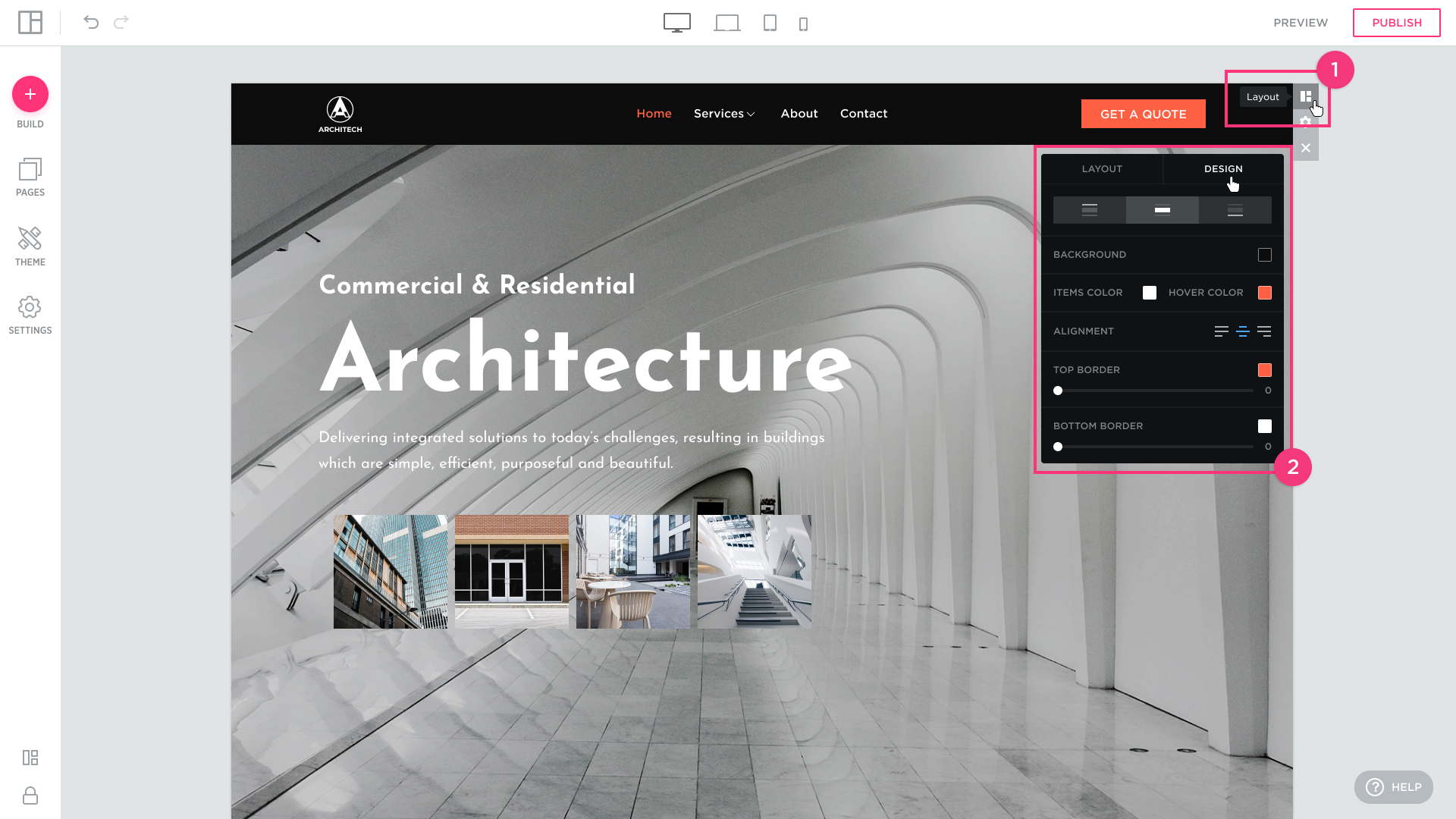
The DESIGN tab of the Settings dialog allows you to change:
- the background color of the header;
- item color and hover color of the text Navigation Menu;
- alignment of the Navigation Menu;
- width and color of the top and bottom borders.
BACKGROUND COLOR: click the square to open the color picker and select the background color for the website Header.

ITEM COLOR: click the color square to open the color picker and select the default color for the menu options (item color settings are applied to logo color settings).
HOVER COLOR: click the color square to open the color picker and select the color for the hover menu options (the current page and the page you hover over with the mouse cursor).

ALIGNMENT: align the Navigation Menu to the right, to the left, or choose to place it in the central part of the allotted header space.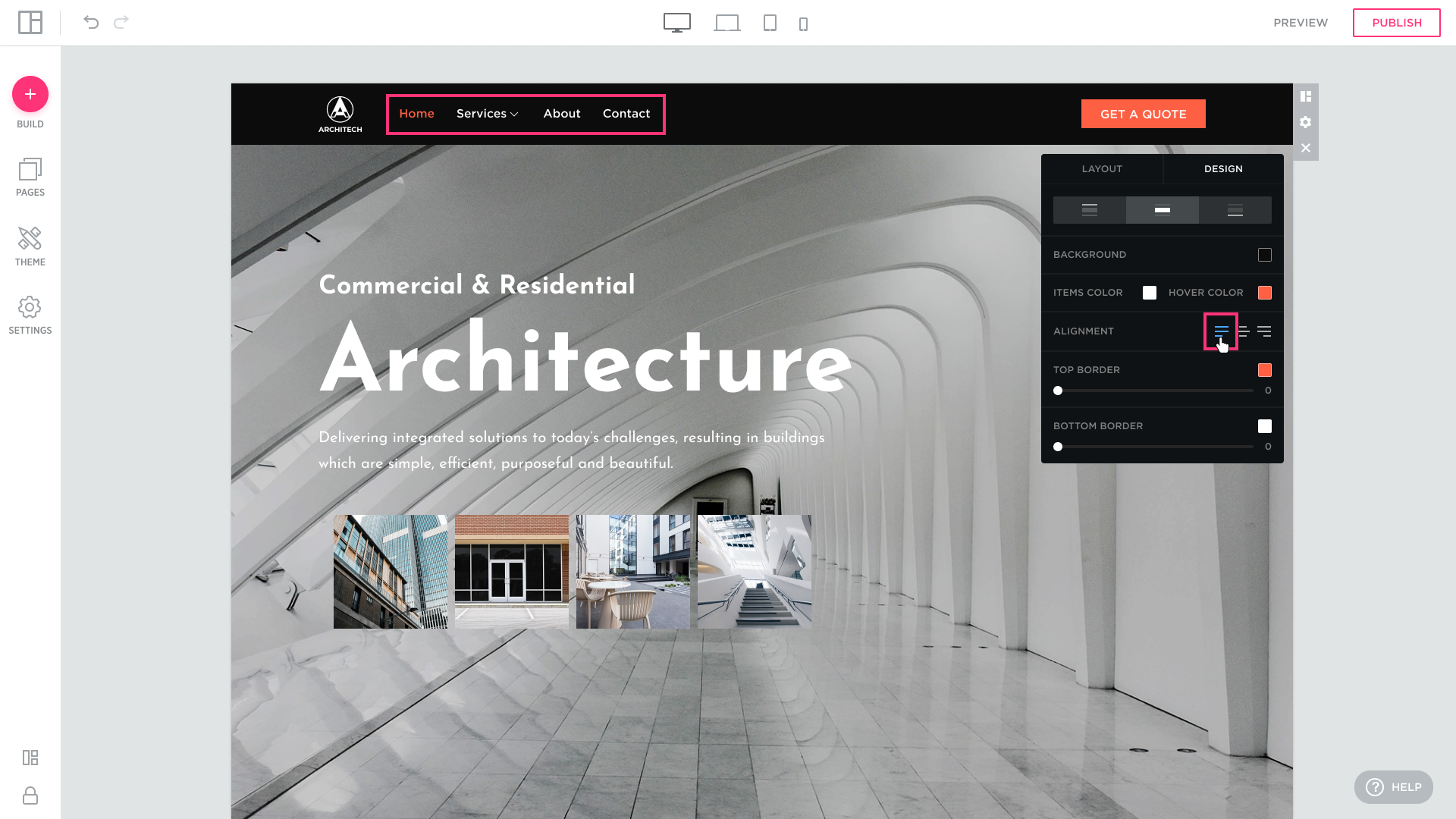


TOP BORDER & BOTTOM BORDER: drag to set the width of the top and bottom borders of the header. Click color squares to open color pickers and select colors for the top and bottom borders.


HAMBURGER MENU:
- hover over it and click the Settings icon in the right-hand floating sidebar that appears;
- select the Hamburger Menu format for the Navigation Menu:


You can have up to 4 header elements in any given Header. There must be at least one element in a website Header.
FIXED MENU: enable the option to freeze the navigation position at the top of the browser while you scroll down the page.

- You can also change the transparency level in the navigation. This option only affects navigation at the top position. When the page is scrolleв, the navigation reverts to solid to maintain a better level of navigation accessibility. To configure go to Layout -> Design:

To remove an element from a Header:
- open the Settings editing box, MENU tab, and hover over the element with the mouse cursor to display the Delete [x] button:
- click the Delete button [x].

To add an element to the header click the ADD FEATURE control at the bottom of the LAYOUT list:
- click an available layout element in the ADD FEATURE pop-up that appears (the name of the feature will be indicated in the lower corner and the number of possible elements of this feature in the upper corner):

The selected element will be immediately added to the Header.
To add an element to the Top-bar and Sub-header click the required tab and ADD FEATURE control: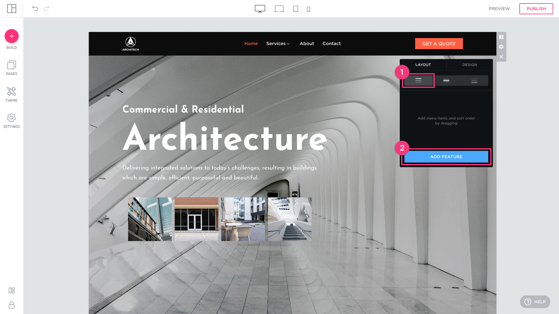 Select the desired item in the popup:
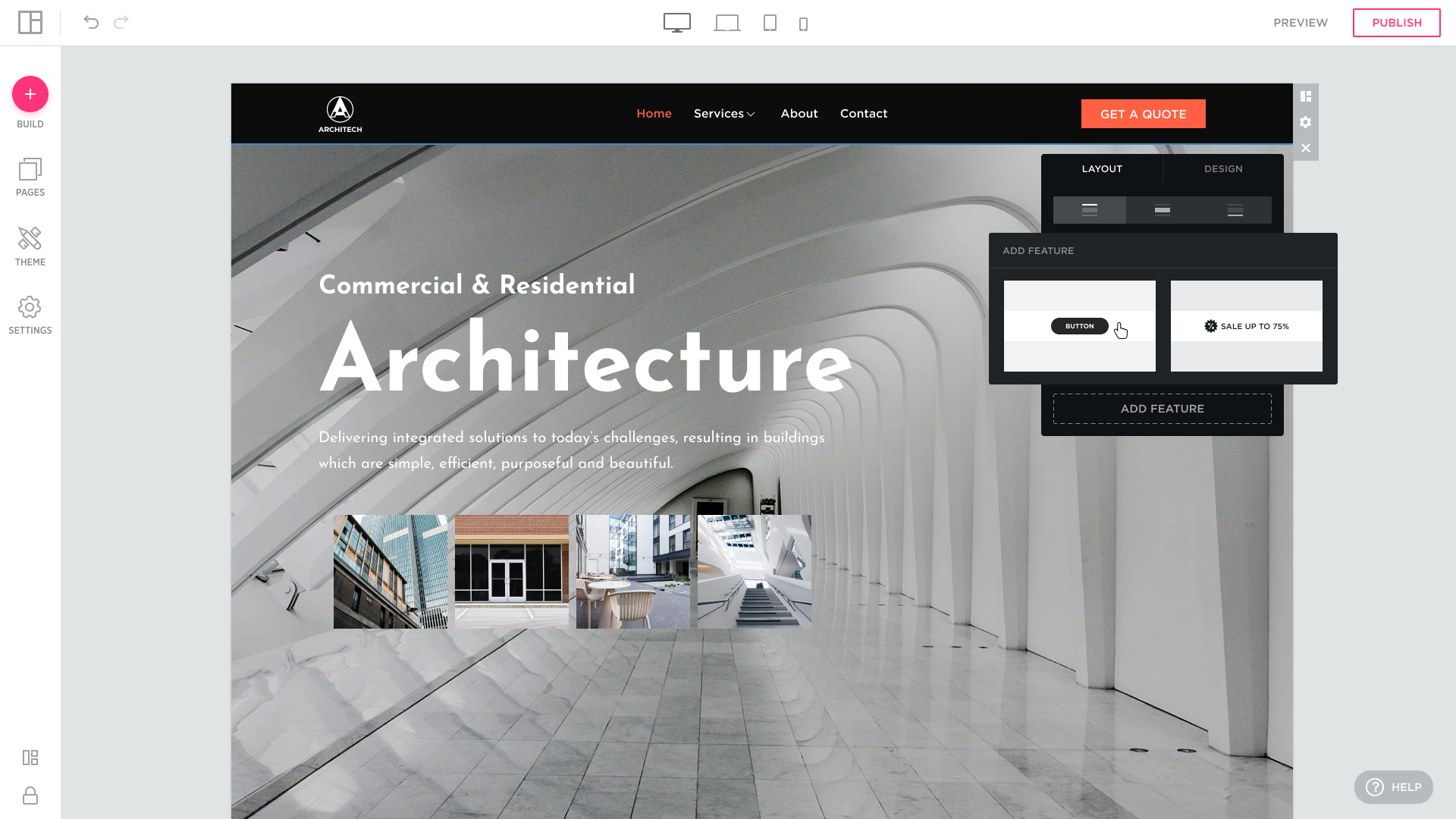
The selected element will be immediately added to the Top-bar:
(if you remove the last item, the Top-bar disappears automatically).
This is how the added element looks like in the Sub-header when you adds an element:
(if you remove the last item, the Sub-header disappears automatically).
You can rearrange the layout elements from the LAYOUT list under the MENU tab by simple drag-and-drop:
To create a custom look and feel for a website Header, edit the header elements.
Customizing a Logo
With Site Editor, you can customize logo text or upload a logo image, link your logo to the home page, and more.
Follow the steps below to customize a LOGO:
- hover over the Logo in the website Header and click the EDIT button that appears.

Alternatively, in the Header Settings dialog > MENU tab > LAYOUT list, hover over the LOGO and click the EDIT button that appears:
- In LOGO settings, select the Type of the Logo: IMAGE or TEXT.
IMAGE selector tab: select IMAGE and add a logo image by simple drag-and-drop.
The uploaded image will immediately appear in the Header.
TIP: You can also click the Logo placeholder and open the Upload dialog to locate the image on your computer or provide a link to the image.
TEXT selector tab: select to specify the Logo text with a custom look and feel:
NAME: type the Logo text into this field.
FONT SIZE: drag to set the font size for the Logo text.
FONT: select the font for the Logo text.
STYLE: select the style for the Logo text: Regular, Regular Italic, Bold, or Bold Italic.
ON CLICK LINK TO HOMEPAGE: select to redirect your visitors to the Home Page when they click the Logo in the Header.
Customizing a Navigation Menu
Site Editor allows you to select a navigation theme for the menu, customize the font of items in the navigation menu, their style and font size for the menu options, as well as set the size of padding between options in the navigation menu.
Follow the steps below to customize a Navigation Menu:
- in the Header Settings dialog, under the MENU tab, hover over the NAVIGATION element and click the EDIT button that appears:
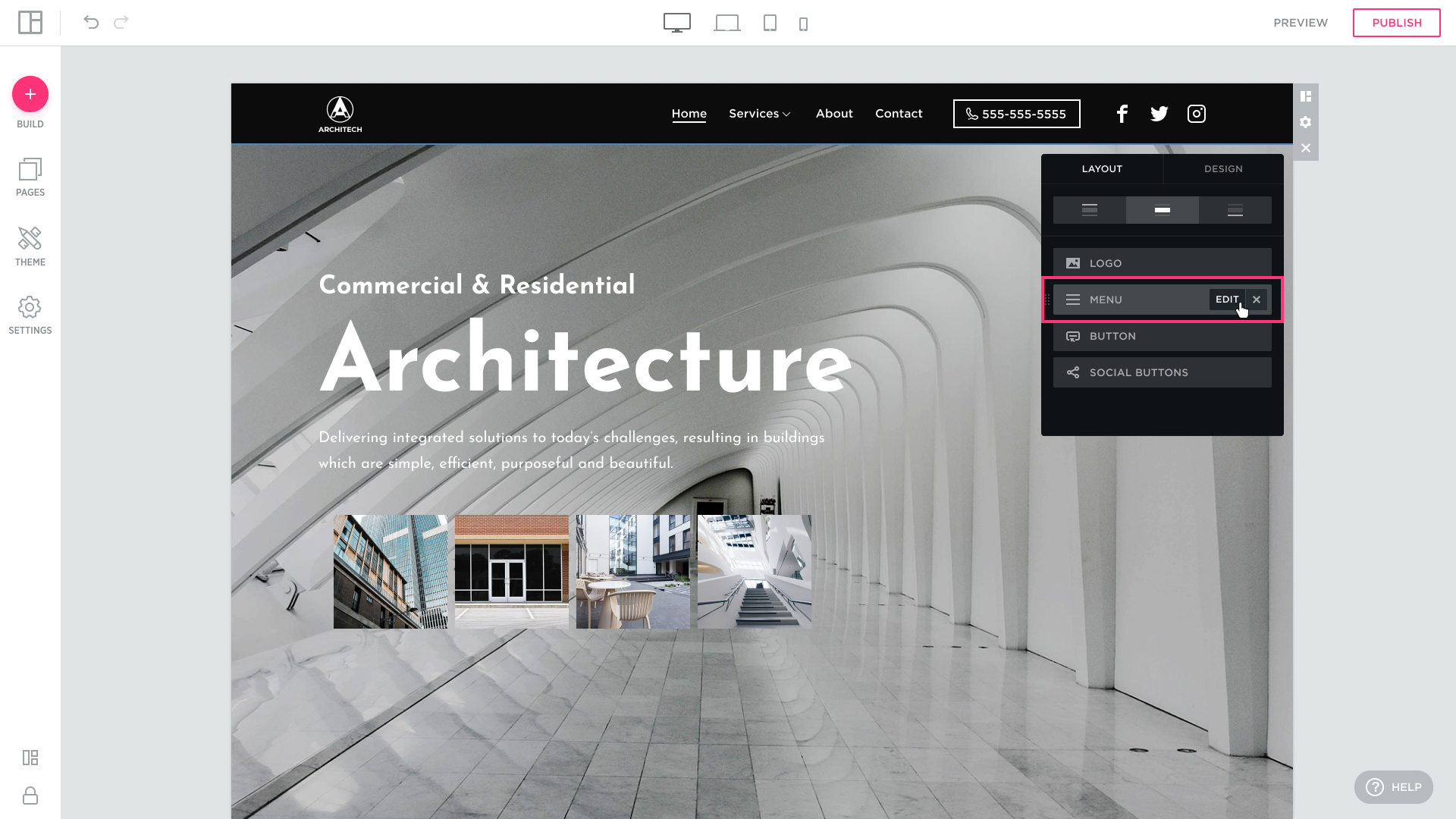
- modify Navigation settings from the editing box that appears:

FONT SIZE: drag to set the font size for the Header elements. 

PADDING: drag to set the size of padding between the options in the Navigation Menu:

FONT: select a font for the Navigation Menu.
STYLE: select one of the available styles for the Navigation Menu: Light, Light Italic, Regular, Regular Italic, Bold, or Bold Italic.
FORMAT: select a format for the Navigation Menu from the drop-down of available ones: Default, Uppercase, Lowercase, Capitalize, or Small Caps.
NAVIGATION THEME: click to select a navigation theme from the box of available templates.

Customizing a Social Section
Site Editor allows you to customize the social section of the website header by adding social network buttons of your choice from the set of available options, connecting actual social network accounts to the selected buttons, and rearranging these buttons inside the social section of the website header to suit your needs. You can also choose to open some or all of the social networks in a separate tab when visitors click the buttons on a live website.
Follow the steps below to customize a Social section:
- in the Header Settings dialog, under the MENU tab, hover over the SOCIAL element and click the EDIT button that appears:

The SOCIAL LAYOUT page that appears allows you to add social network buttons to the website header, connect these items to social network accounts and rearrange them by simple drag-and-drop.

To add a network to the Social section of the header:
- on the SOCIAL LAYOUT page of the Social Settings dialog, click ADD NEW NETWORK. In the ADD SOCIAL BUTTON pop-up, click the social button you would like to add to the website header:


The selected button will immediately appear both in the website header and on the social networks list in the Social Settings dialog:
- to connect the button to an actual social network account, hover over the name of the social network in the Social Settings dialog and click the EDIT button that appears:

- enter the profile name or link into the LINK field that appears:

OPEN LINK IN NEW TAB: select to open the social network account in a new tab.
You can rearrange social network buttons in the website header from the Social Settings dialog by simple drag-and-drop:
Customizing a Button
Site Editor allows you to customize the button text, its font, style and format, select letter spacing, button type and shape, border size, background color, link the button to a page on this site, external URL, file, email address, or phone number, and more.
Follow the steps below to customize a Button:
- in the Header Settings dialog, under the MENU tab, hover over the BUTTON and click EDIT that appears:

- from the BUTTON SETTINGS page, customize:
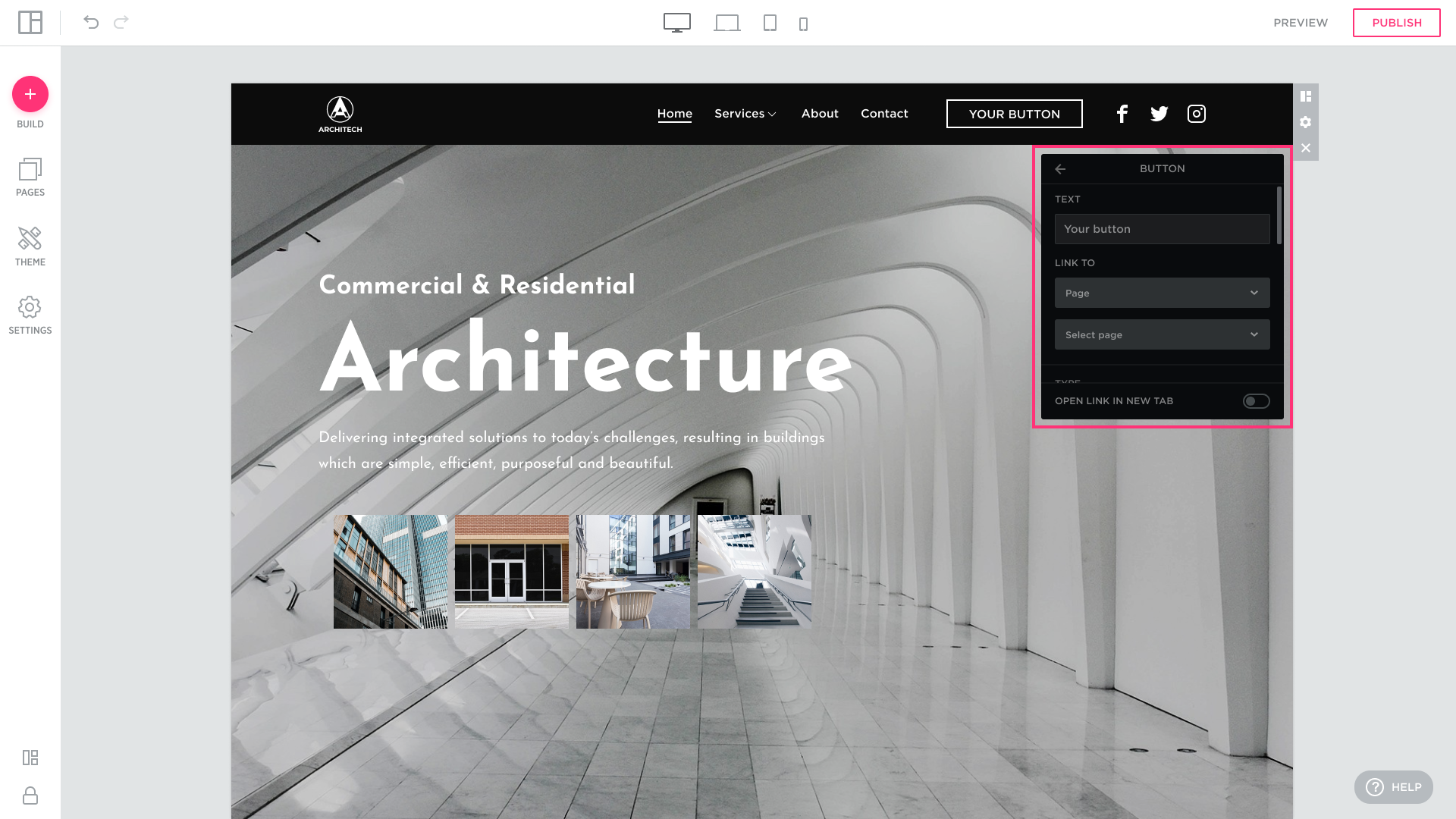
TEXT: specify the text to appear inside the button:
LINK TO: choose to link the button to a:
- Page on this site:


- External URL: copy and paste the URL to an external page into the URL field:

- File (which will be downloaded when visitors click the button on the live website):


Permitted file types:
- Images: ‘jpg’, ‘jpe’, ‘jpeg’, ‘png’, ‘gif’, ‘bmp’, ‘svg’ ‘tiff’. Max File Size: 15 MB.
- Documents: ‘css’, ‘html’, ‘htm’, ‘xml’, ‘doc’, ‘docx’, ‘pdf’, ‘otf’, ‘rtf’, ‘xls’, ‘eps’, ‘zip’, ‘gzip’, ‘csv’, ‘ppt’, ‘pptx’, ‘odt’, ‘ods’, ‘odp’, ‘odf’, ‘odc’, ‘xlsx’, ‘txt’, ‘js’, ‘sketch’, ‘ai’, ‘psd’, ‘psb’, ‘cdr’, ‘cad’, ‘max’, ‘obj’, ‘rar’, ‘7z’, ‘tar’, ‘tar.gz’, ‘bz2’, ‘stl’, ‘fbx’, ‘vrml’ .odt, .odp, .ods, .odg, .odf, .sxw, .sxi, .sxc, .sxd, .stw .dwg, .dwt, .dxf, .dwf, .dst. Max File Size: 25 MB.
Email: specify the email address the emails will be sent to.

When the visitor clicks the button on your live site, a new empty message opens up with the mailto address field prefilled with the email address specified here. The Email client installed on the visitor’s computer, such as Outlook, will be used. If the visitor has no Email client installed, the browser will try to open a web based email service according to user browser settings.
Phone: specify the phone number to call when the button is clicked. The browser will try to call the number using one of the available web-based or desktop calling services or applications, such as Skype or Viber, depending on the browser settings. If the button is clicked on a cell phone, the visitor will be redirected to the Phone application. The specified number will be prefilled in the Phone Number field.
TYPE: select button type from the drop-down list of available options: Primary Solid, Secondary Solid, Primary Outline, Secondary Outline, or Link. Also, select a shape for the button.
- Primary solid


- Secondary solid
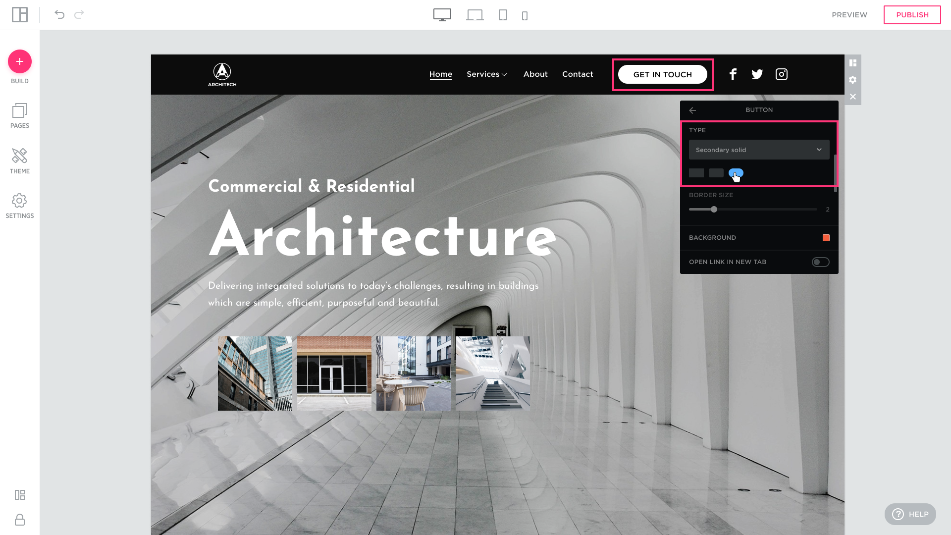


BORDER SIZE: drag to set the border size for the outline of the button; the BORDER SIZE control is enabled only when you select the Primary Outline or Secondary Outline button type.


BACKGROUND: click the square to open the color picker and select the color for the button’s background or outline.

LETTER SPACING: drag to set the letter spacing for the button text.

FONT: select font for the button text.
STYLE: select style for the button text: Regular, Regular Italic, Bold, or Bold Italic.
FORMAT: select format for the button text: Default, Paragraph, Uppercase, Lowercase, Capitalize, Small Caps.
Customizing a Slogan
Site Editor allows you to customize the slogan text, its font, style and format, link the slogan to a page on this site, external URL, file, email address, or phone number, and more.
Follow the steps below to customize a Slogan:
- in the Header Settings dialog, under the MENU tab, hover over the SLOGAN and click EDIT that appears:

- from the BUTTON SETTINGS page, customize:
TEXT: specify the text to appear inside the Slogan:
FONT SIZE: drag to set the font size for the Slogan text:
FONT: select the font for the Logo text.
STYLE: select the style for the Logo text: Regular, Regular Italic, Bold, or Bold Italic.
FORMAT: select format for the slogan text: Default, Paragraph, Uppercase, Lowercase, Capitalize, Small Caps.
LINK TO: choose to link the button to a:
- Page: page on this site;
- Anchor: special URL that takes you to a specific Block on a page;
- External URL: copy and paste the URL to an external page into the URL field;
- File: which will be downloaded when visitors click the slogan on the live website;
- Email: specify the email address the emails will be sent to.
- Phone number: specify the phone number the phone will be called to.
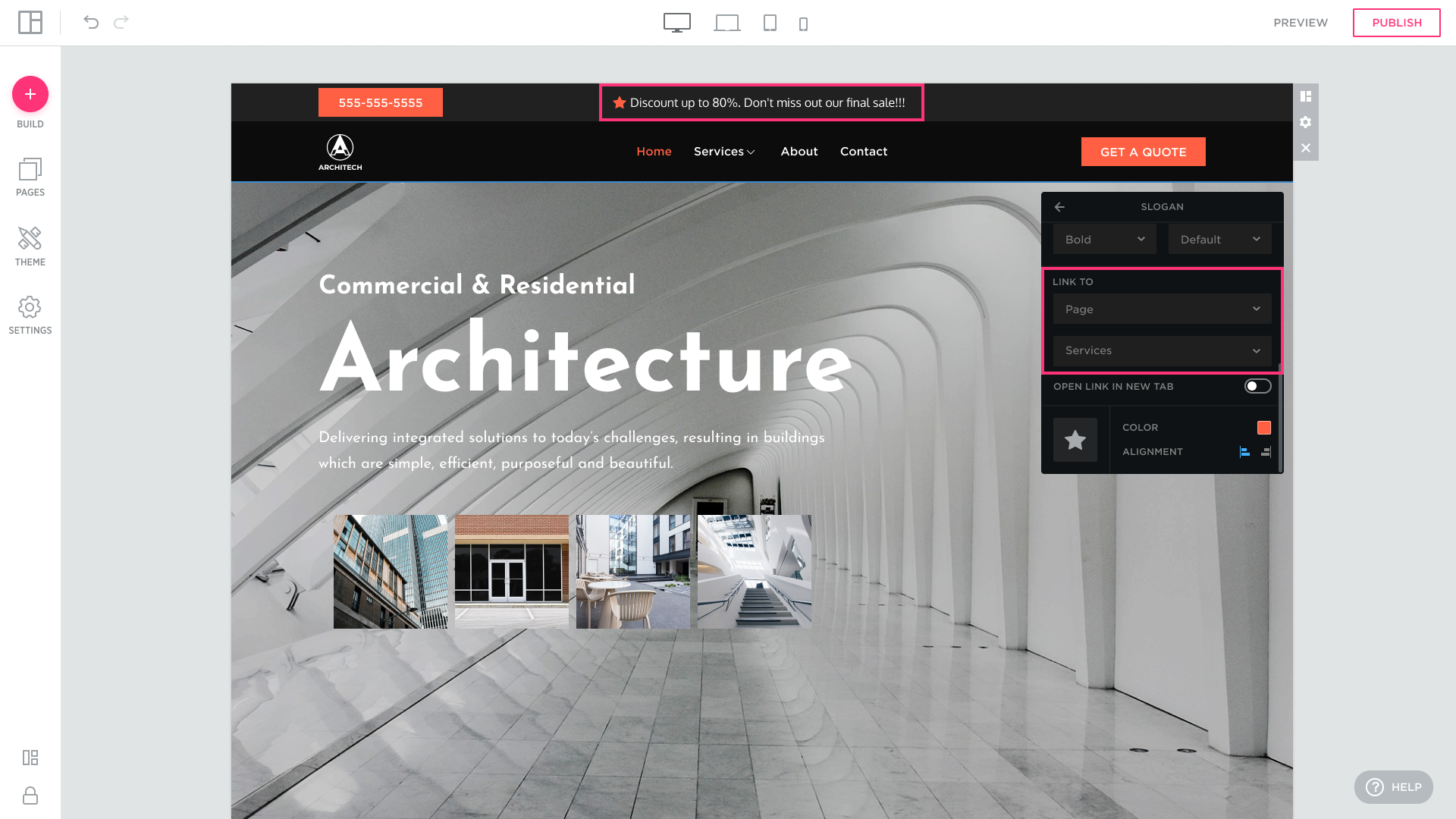
OPEN LINK IN NEW TAB: select to open the Slogan link in a new tab:
Icons Settings:
- replace the icon;
- icons color;
- icons alignment.